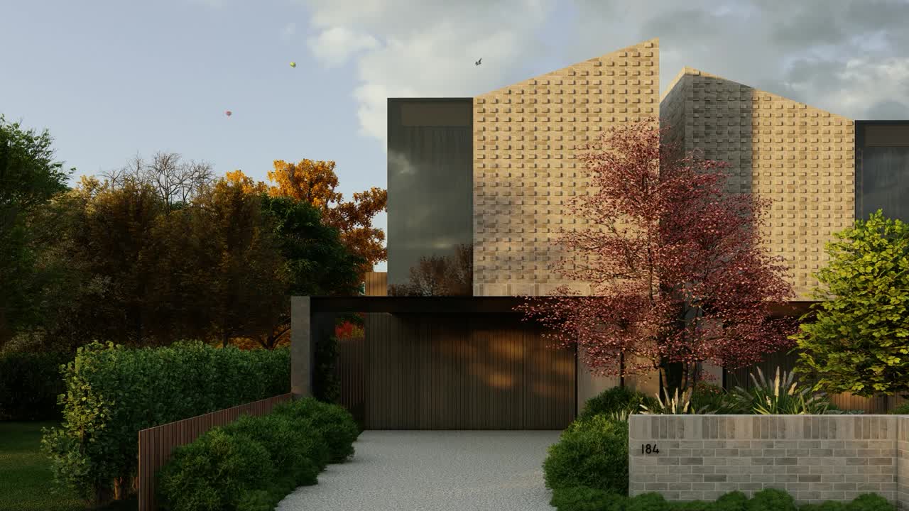
Rise Architecture

Summary
We developed an impressive website for this architectural firm, translating their unique vision into a captivating online experience. Combining sleek design and easy navigation, we created a platform that showcases their architectural expertise while ensuring a user-friendly interface for visitors.
Role:
Webflow was used to implement the website and figma was used to design the template of the website.Tools:
- Webflow
- Figma
- HTML
- CSS
Challenge
Creating a visually captivating layout that effectively conveyed the firm’s unique style and brand identity required careful consideration.
Solution
To address these challenges, we adopted a user-centered approach, conducting thorough research to understand the firm’s target audience. By implementing a clean and intuitive design, utilizing consistent branding elements, and conducting extensive testing across various devices.
Research
Rise Architecture’s existing logo had already established a strong brand identity, characterized by the skillfully positioned compasses symbolizing precision. Upon closer examination, we were drawn to the logo’s well-balanced proportions and its clean, line-based design. Extensive research into other architecture firms revealed a prevalent trend of angularity in their visual identities.
To differentiate Rise Architecture, we swiftly brainstormed fresh ideas, aiming to let their portfolio speak volumes. However, a key challenge arose we recognized the need for compelling visuals, including high-quality images and illustrations, to effectively showcase their exceptional work, allowing it to shine without relying on excessive verbal communication. Thus you would notice our heavy use of such techniques.
Design
In response to Rise Architecture’s preferences, we devised multiple design concepts, taking cues from their logo and leveraging the power of high-quality visuals to augment the inherent elegance of their work, while upholding a strong sense of professionalism.
Acknowledging their need for contextual information, we meticulously crafted pages that seamlessly integrated this content, ensuring a cohesive and well-balanced design that catered to their diverse requirements. Through a collaborative approach, we successfully arrived at a design solution that harmonized their brand identity, showcased their projects beautifully, and accommodated the desired contextual elements.